Experiences, Interactions, Interfaces
01
Verifone (inernal) product reband
year
2024
stack
Here is a quick overview of the rebrand where I produced this internal video to introduce the new look, feel, and interactions of the revamped product spaces. This was a gigantic global effort.
(audio muted)
.problem
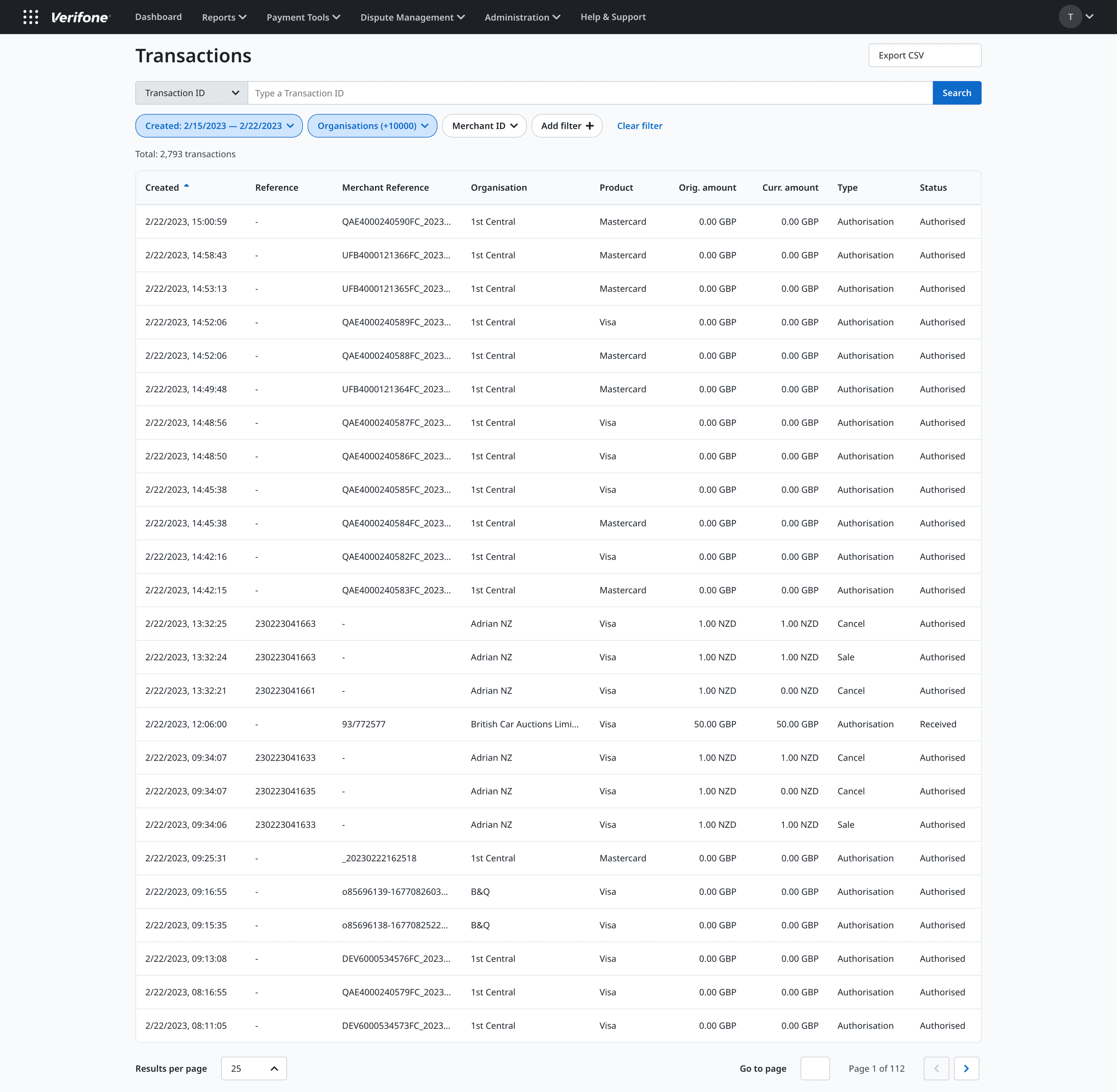
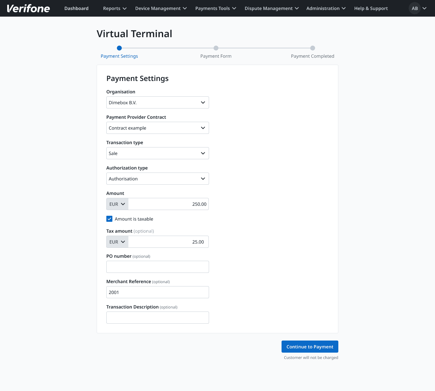
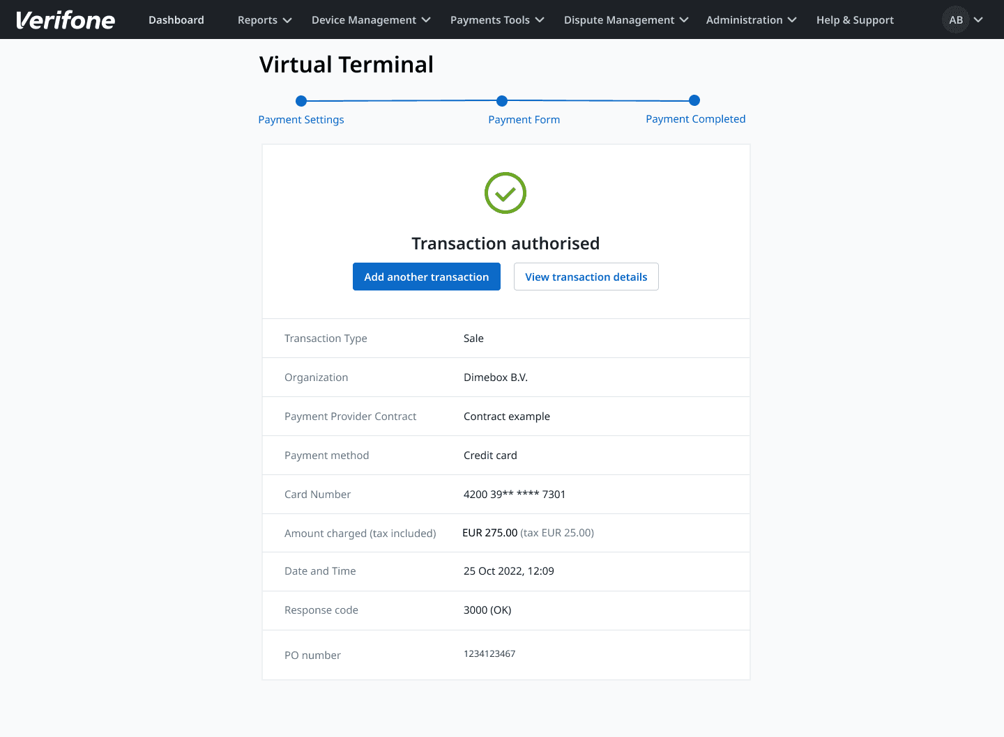
Below (Before 2): Example of web app flow. Unnecessary step segregation, especially when step three, in this instance, is confirmation of the aggregate of the last two screens.
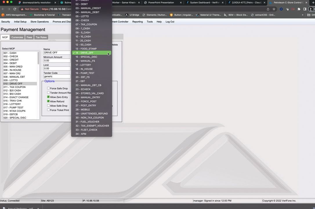
Below (Before 3): Legacy web apps (Petro/Gas Station interface shown) in need of UX improvement and IxD consistency, however, with a large user base with 'muscle memory' of flow and context within the existing app.
.the After (solutions)
Collaborate, plan, plan to communicate, communicate broadly, then do.
Above: Where dev teams were in silos and not using a design framework in a unified fashion (instances of the framework, duplication of assets and efforts), I established the source/sources of truth and new workflow streams. In addition, the UxD team created a centralized CDN, automated asset optimization, and set a course for development teams to embrace a CICD culture.
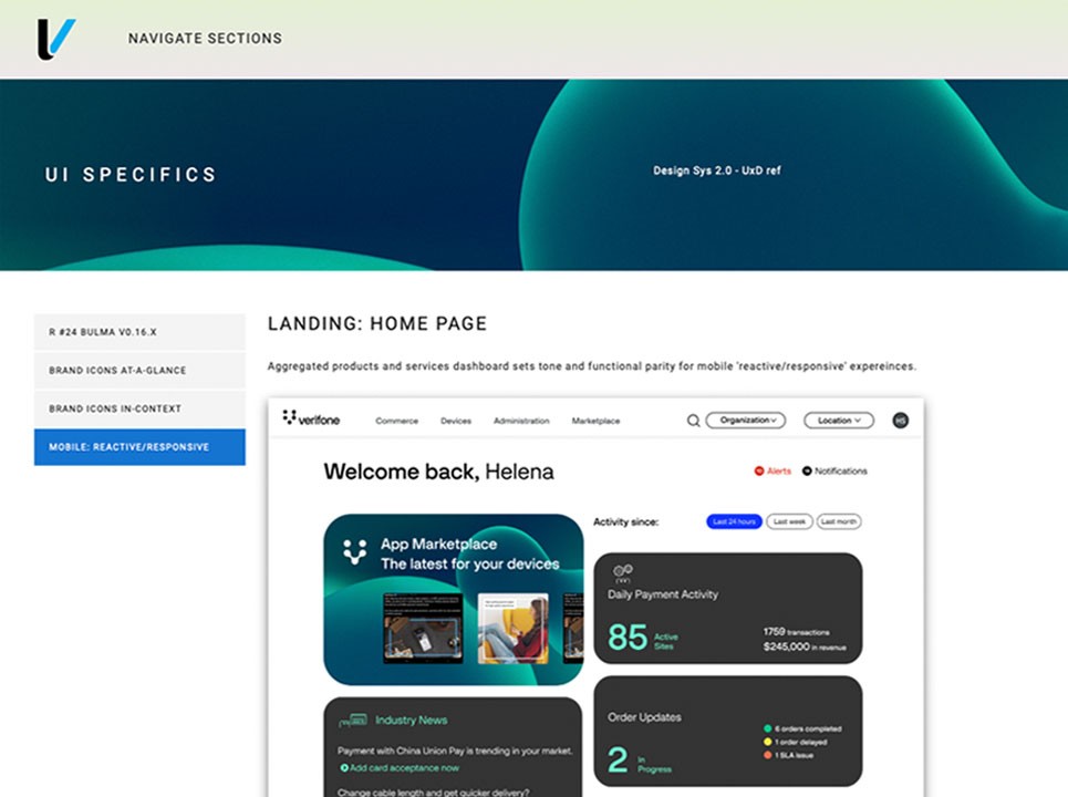
Above: Internal reference site created. Big themes, layers vs. pages, consistency of interactions and visual language, and new method to distill complexity and cognitive overload.
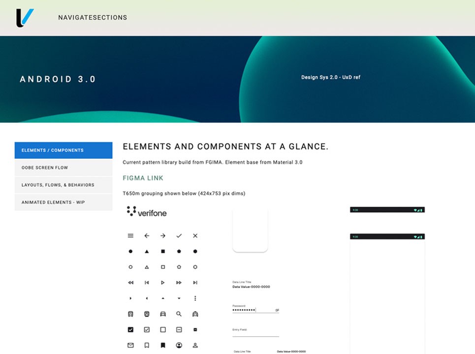
Above: In preparation for the 'grand' execution, further efforts led to the UxD team developing a more efficient standard for documentation, ease of development, and ensuring practices and standardization were able to be managed and kept in check. To do this, we utilized Storybook leveraging existing BULMA (CSS) to then standardize the use of variables and the outcome stability for the derived variables. We later created an Angular version of Storybook, integrated with Figma, leveraging Storybook Knobs and Controls to make lives easier for all dev partners.
Above: We collaborated intensely with the Petro team as they had the most complex environment with the most aggressive delivery schedules. The pitch was that they should adopt the new design system now vs. creating in the old to only have to redo the efforts after the new brand launch. Additionally, it would prove to be beneficial for the global portal teams to leverage Petro's advancements for the new brand transition… those teams would see by example the 'better path.' They'd be the heroes… and they were.
Above: Defining The new common landing for the aggregated portal activity. Quick pivots and layered reveal of detail/data.
Above: Portal web apps are more compact and keep relevant inputs in a single vs. segregated view.
02
Oak OS Dashboard
year
2018
timeframe
3 months
stack
Adobe Ps/Ai, HTML5, CSS3
The OAK OS dashboard provided a single viewport solution for total device estate telemetry, software distribution, and experience management.
The design drew from the concept of a 'stellar formation.' A configuration like a galaxy can be customized to meet customer requirements (area, region, outlet, jurisdiction, and so on). The 'sun' symbolizes the central unit (kiosk/device group). The sub-units, or interactions, are depicted as 'circling celestial bodies.' Selecting a task or identifying problems was just a matter of zeroing in on the desired option within the user interface.
03
Home Depot How to Hub Kiosks
year
2016
timeframe
7 months
stack
Adobe Ps/Ae, HTML5, CSS3
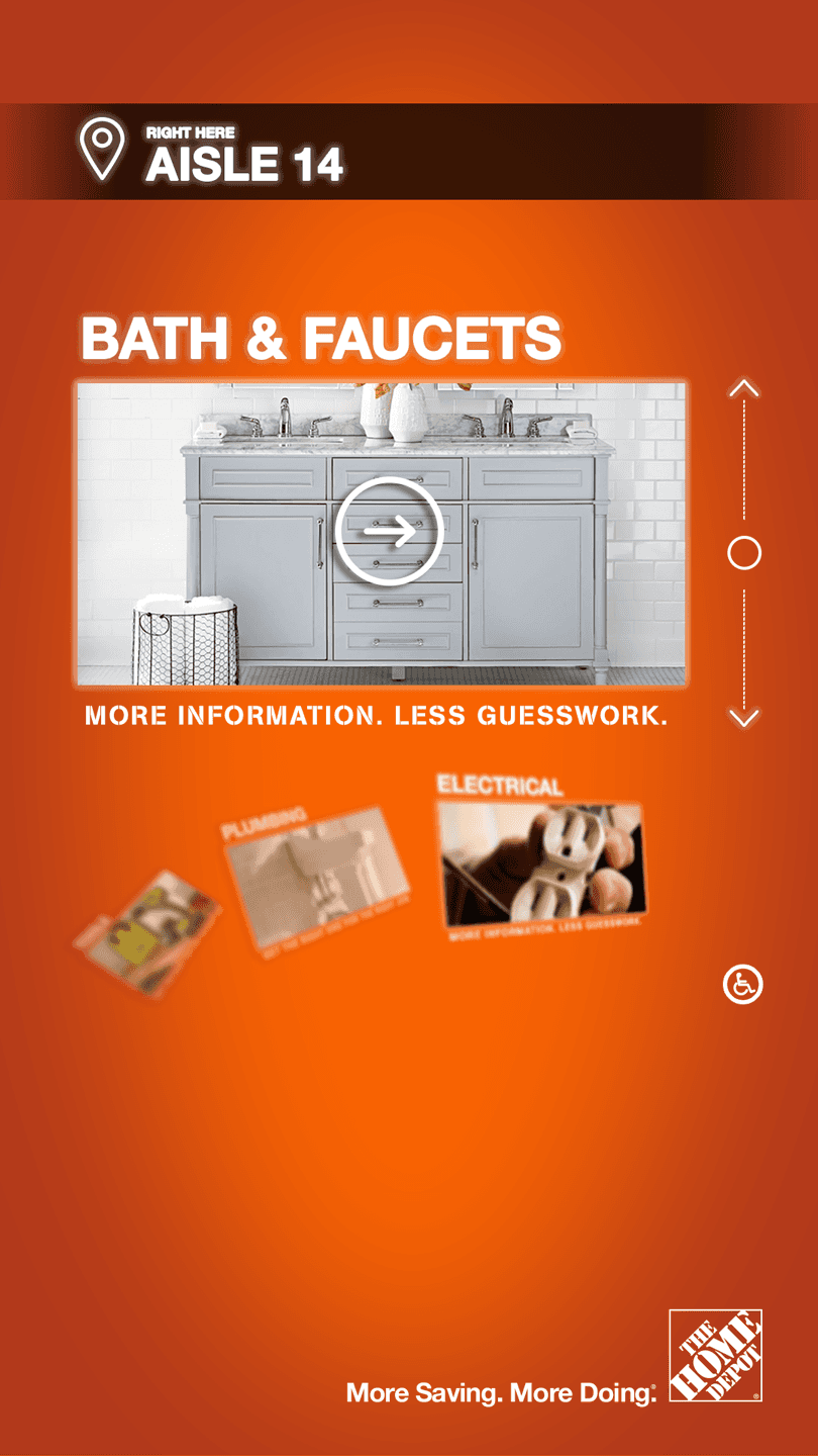
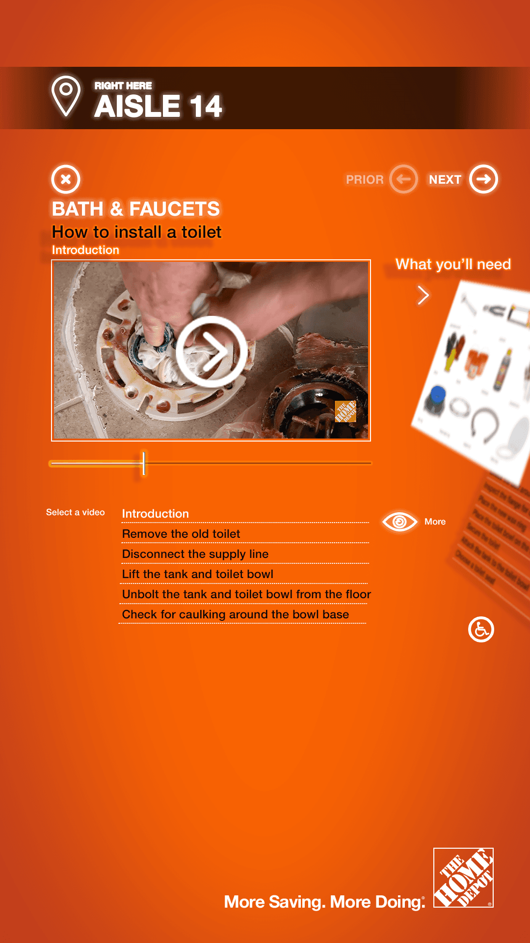
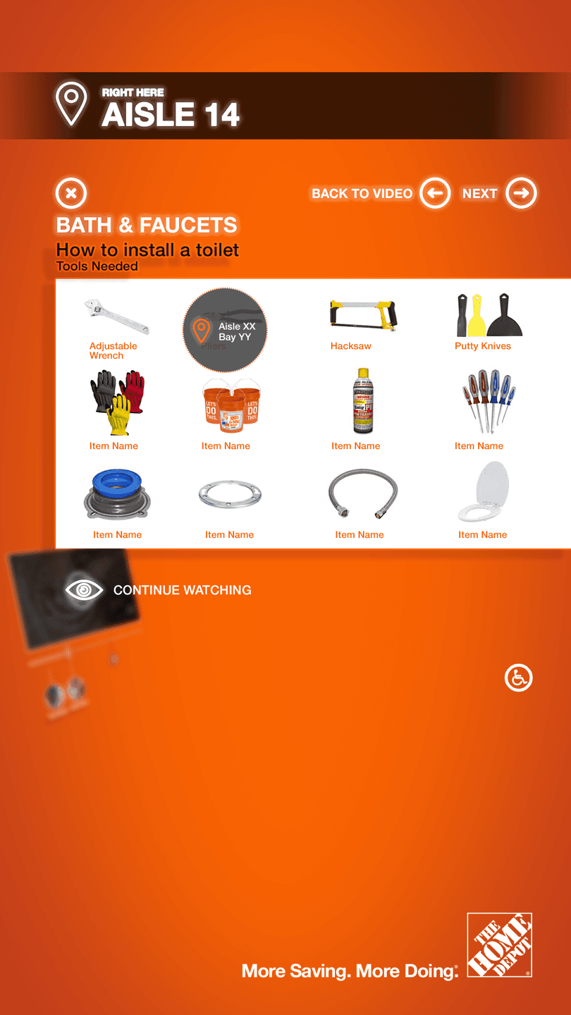
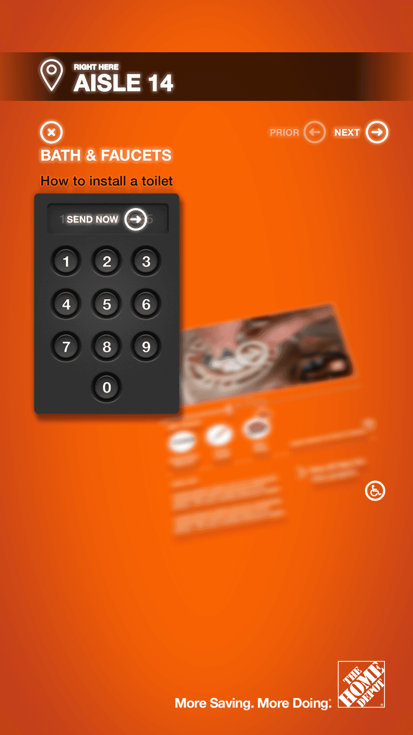
The Home Depot kiosks were developed to provide in-store product locating and meaningful contextual shopping and instructional pivots.
The user journey provided 'up-sell' and product recommendations within how-to instructional videos, useful buyer tools, and automated shopping list list creation based the user's project scope/needs.
Future evolution. Concept to extend the experience for full self-service, from selecting, to purchase, and scheduling installations/contractor services.
04
Oak Labs "Magic" mirror
year
2015-2018
timeframe
stack
OAK OS, Adobe Ps, HTML5, CSS3
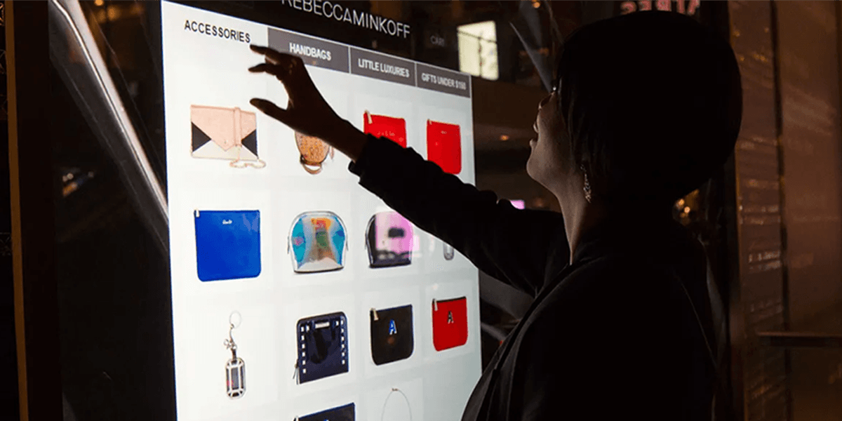
First developed and deployed during my tenure at the eBay Retail Innovation Lab, and launched with Rebecca Minkoff in 2014, this entirely new stack included our Debian-based OS (OakOS), which made client integrations, the administration and management of devices and experiences incredibly efficient.
Client deployments included Ralph Lauren, continuation and upgrades for Rebecca Minkoff, and an evolution outside the fitting room for Ulta Beauty (makeup mirror).
Fitting room mirror experience
Adapted stack for Ulta Beauty
05
Verifone Booth Wayfinding
year
2020
timeframe
2 months
stack
Adobe An, HTML5, CSS3
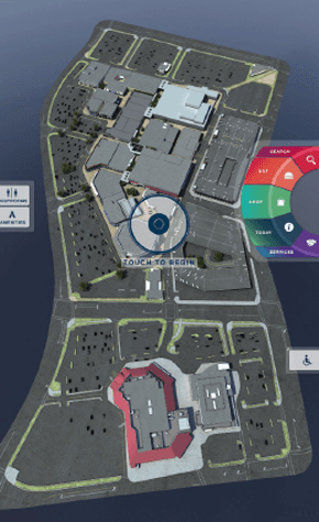
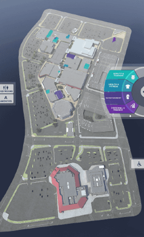
This experience incorporated a 3D modeled environment of the floor plan for Verifone's tradeshow booth at NRF 2020.
The kiosk served to inform and visually draw foot traffic for users to engage and discover Verifone's product and service offerings.
06
Interactive wayfinding kiosk
year
2014
timeframe
3 months
stack
Unity, Adobe Ps, HTML5, CSS3
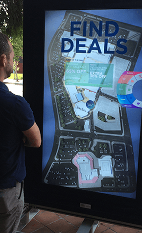
During my tenure at eBay Retail Innovation, I had the honor to envision a project for Simon Property group. We had just about three months for production, which included engineering of the kiosk housing, experience production, a CMS build, and hardware installation.
I hired 'First Person' (1P), a full-stack agency in SF, to develop the vision for Front-End (First of its kind: 3D contextually immersive GUI), the Middle-Tiers, and Back-End. LGMRI manufactured the case form and supplied the literally, bullet proof touch display. This was awesomely intense and an almost 'impossible task', with all parties delivering beyond my expectations.
Starting interaction.
Targets highlighted,
07
Verifone kiosk commerce app
year
2022
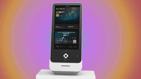
This demo app was showcased as an example of Verifone’s commerce integration and ‘white-label’ capabilities at NRF 2022 trade show. Notably, this was also a ‘skunk-works’ app dev and software distribution / management exercise. We utilized an IOT platform (Balena.io) to manage the software provisioning and the peripheral device connections/maintenance (Payment Terminal, Touch Controller, Printer, etc).
The results were:
- One-hour remote set up with an on-site associate without knowledge of the stack.
- ZERO operating downtime.
-Saved 3+ months of dev time (built by myself and one full-stack SW engineer in 1.5 weeks)
08
Shoppable Storefronts
year
2014
timeframe
3 months
stack
Adobe Ps/Ai/Id, HTML5, CSS3
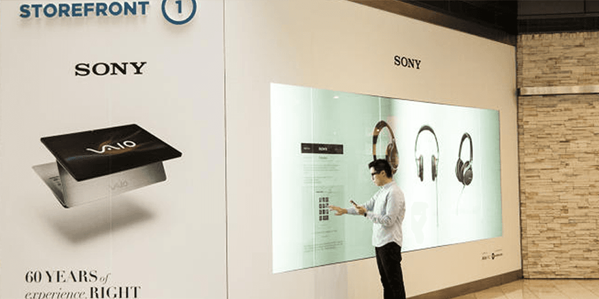
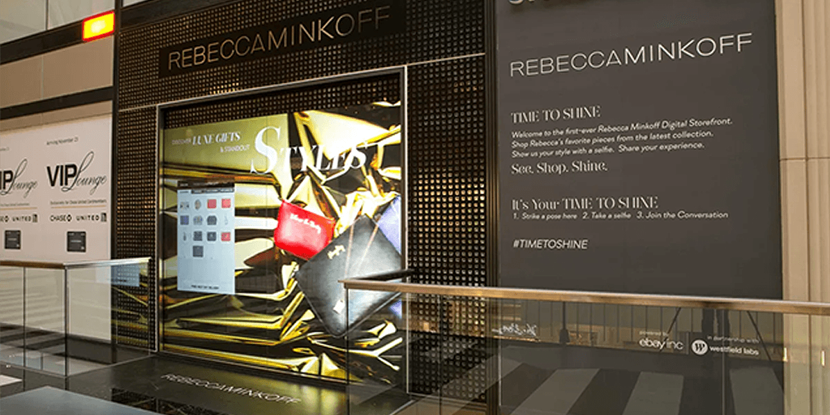
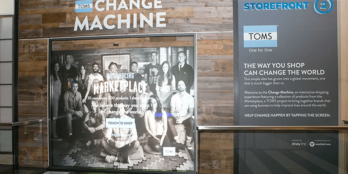
This was an incredible undertaking! In just 3.5 months, we successfully sold, planned, and executed a major project. As a result, Sony, Toms Shoes, and Rebecca Minkoff took over empty storefronts in San Francisco's Westfield Shopping Center. I was responsible for crafting the Interaction Design for all three brands, assisting the brands hands-on with the visual design, and the entire environmental design, including overseeing production and installation. It was an amazing experience!
09
Verifone service feature flow
year
2022
timeframe
stack
When I was at Verifone, our President of North America Sales came to me 'last minute' and requested one of our stock assets of a demo flow showing how we were extending the Cryptocurrency payment feature experience outside of the payment terminals and into client brand experiences. He said he needed it by the next morning. I took the liberty of creating something special for him and the client by applying some brand 'flavor' specifically tailored for Taco Bell. I heard later that they loved the context of the 'brand-designed' thoughtfulness.
09
eBay 'My Gadgets'
year
2013
timeframe
5 months
stack
Adobe Ps/Ai, HTML5, CSS3
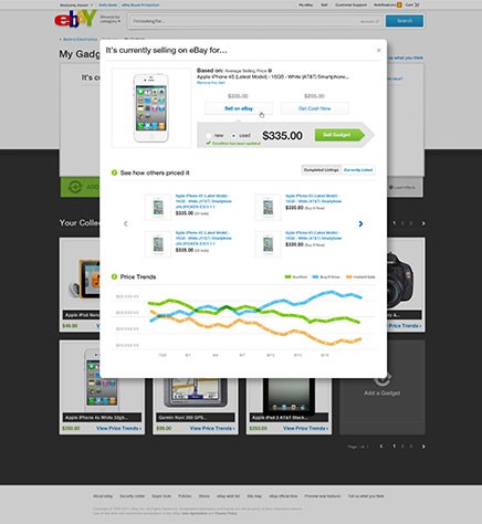
My Gadgets was an eBay portal that was integrated into the Electronics Marketplace. Users could easily add electronics and then see the ʻnet worthʼ of an item or an aggregate of a collection. It provided further convenience for listing an item by leveraging historical sales and catalog data, automation for auto-fill, and setting target price alerts against market trends (popularity) based on other users’ selling trends.
This experience set interaction methods for listing/comparison models across eBay later.
Landing page within Electronics. Grid/Index of the collection of items added.
Adding a Gadget. Simplified UI and interaction patterns foreshadow upcoming common interactions across the domain.
The search yields additional details and pivoting opportunities to list, schedule, or get a cash offer for the user's item to be listed.
Expanded detail of an item with pricing trends and listing prices by sellers with similar items.
Aggregated collection value with quick detail on hover to target key data about an individual item.
Quick pivots to get details and statistics about the user's currently listed items.
10
Crypto eComm Payment Integration
year
2021
timeframe
6 months
stack
FIGMA, Ae, HTML5, CSS3
